"Brian Miller is one of the best collaborators that I've ever had the pleasure to work with. He's a tremendously talented artist who's able to take a project and elevate it. There have been many times when I gave Brian a general idea of the effect I wanted a particular book or scene to have and he worked to find the right solution and bring the project to a great finish." — Dan Jurgens, Writer/Artist DC Comics
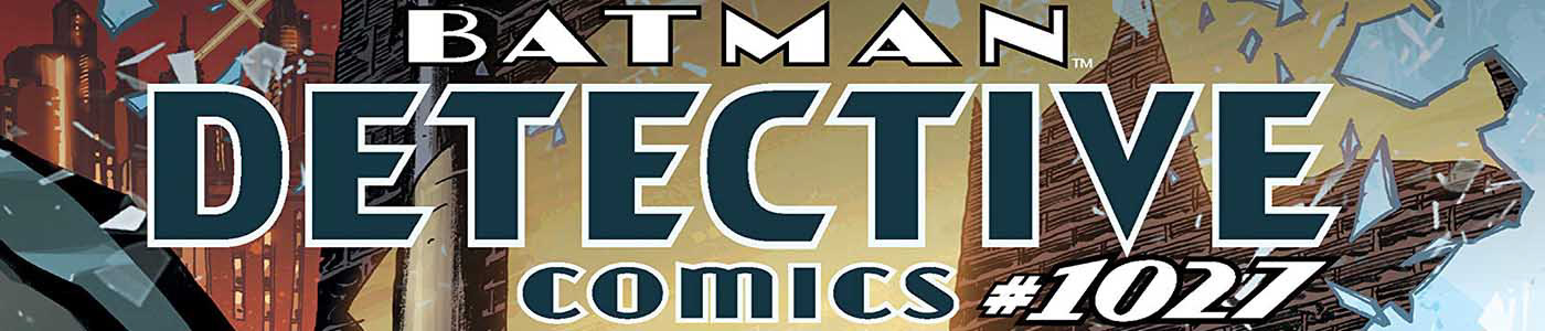
Detective Comics artwork by Dan Jurgens, Kevin Nowlan, & Hi-Fi's Brian Miller
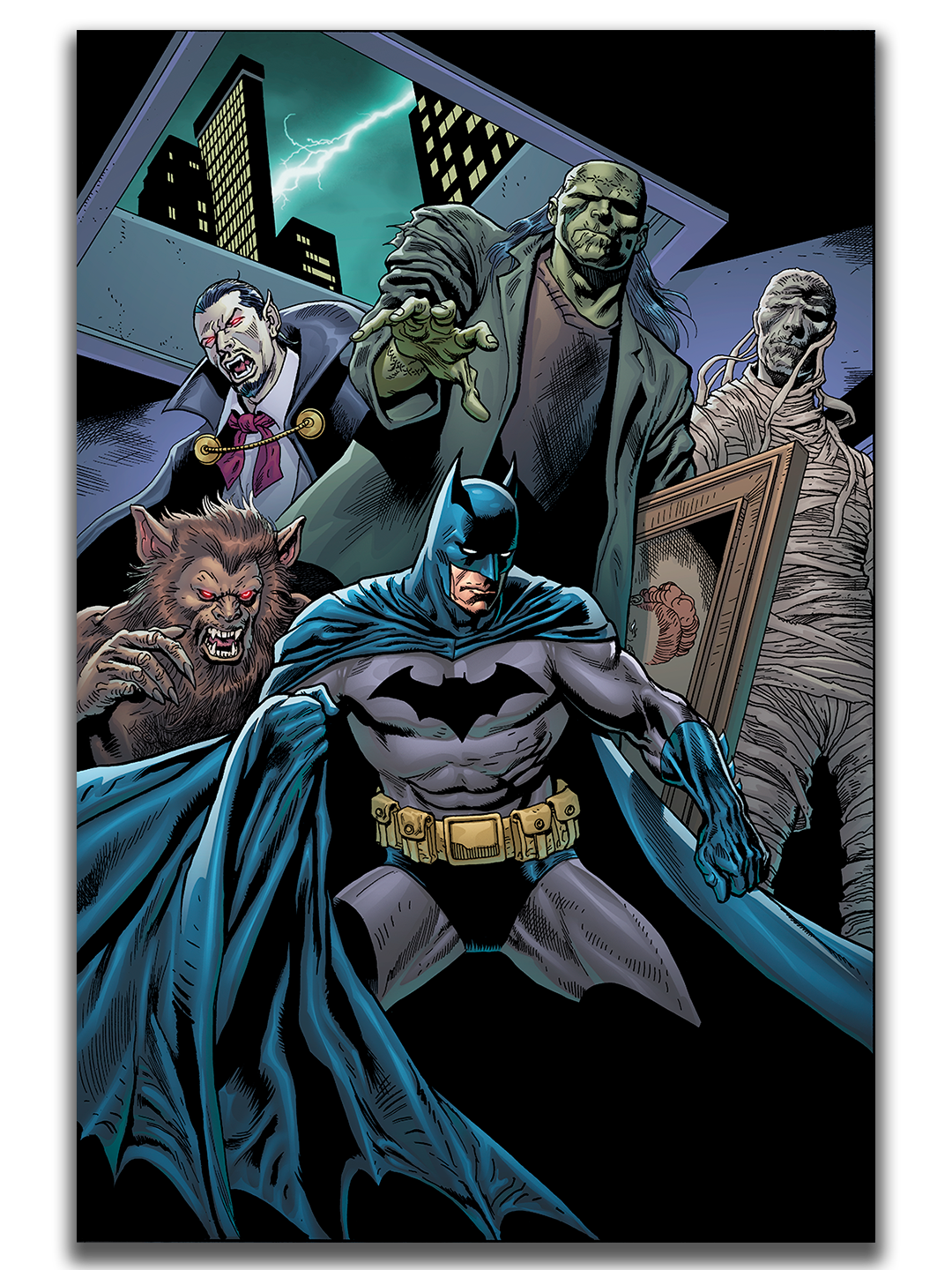
Batman originally appeared in Detective Comics #27 published in 1939. To celebrate 1000 issues of Batman DC Comics published a giant size issue features stories from legendary writers and artists including this story from writer and artist Dan Jurgens. The story features pencils by Dan Jurgens, inks by Kevin Nowlan, with colors by Hi-Fi's Brian Miller. It doesn't matter if I color comics solo or as art director of a team of color artist I ask for the credit to read simply, "Hi-Fi". In that way I am not taking sole credit for what is often a collaborative effort.
Let's take a behind the scenes look at what goes into the color art for a story like this.
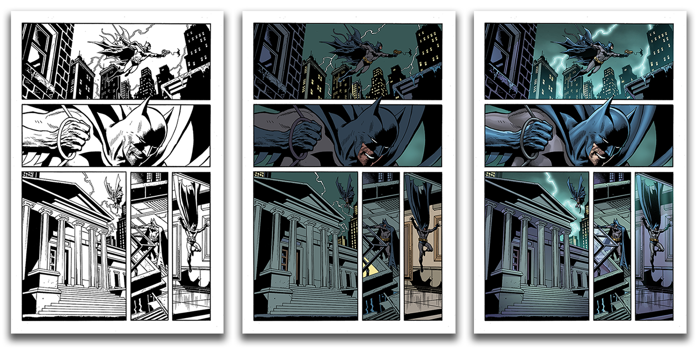
Each page is drawn in pencil and then inked. From there the artwork is scanned and sent to me. The first stage in the coloring process is flats. I may work with flatters or flat my own pages but either way the final flat colors are chosen by me to suit the story, time of day, and mood.
When I am happy with the flats I paint in the light and shadow details using Adobe Photoshop. My goal as a visual storyteller is to convey as much information about the setting and mood as possible. Even taking into consideration when Batman moves from outside to an interior scene and changing up the color palette on the background to make the transition clear to readers of the comic.

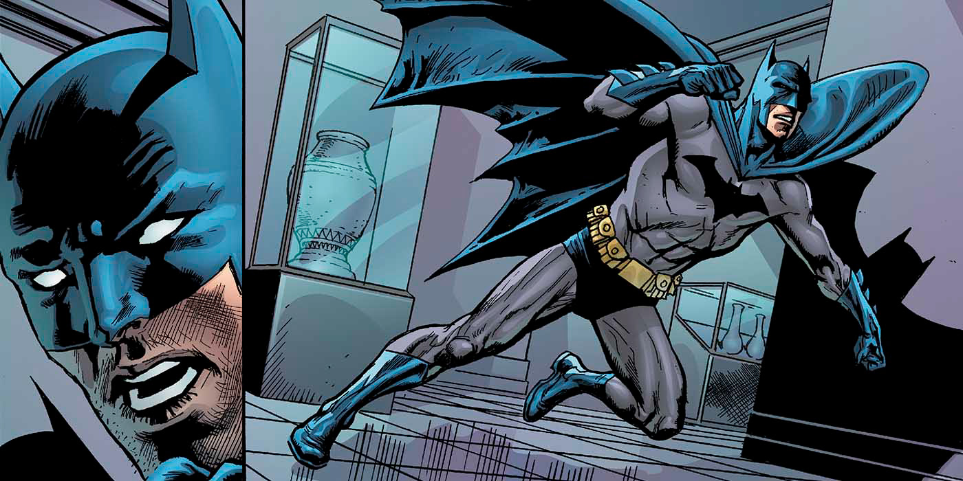
When I am rendering a group of characters or a fight scene I am always focused on the clarity of action. Taking extra special care where one character overlaps another to ensure they don't blend together but stand on their own clearly.
I'm also focused on the setting and atmosphere. Is it a dark and stormy night or a bright and sunny day? In this story we are in a darkened museum with the power switched off. I need to create a dark and creepy mood while allowing the characters to still look dynamic and fully rendered. Even when they are lurking in the shadows.
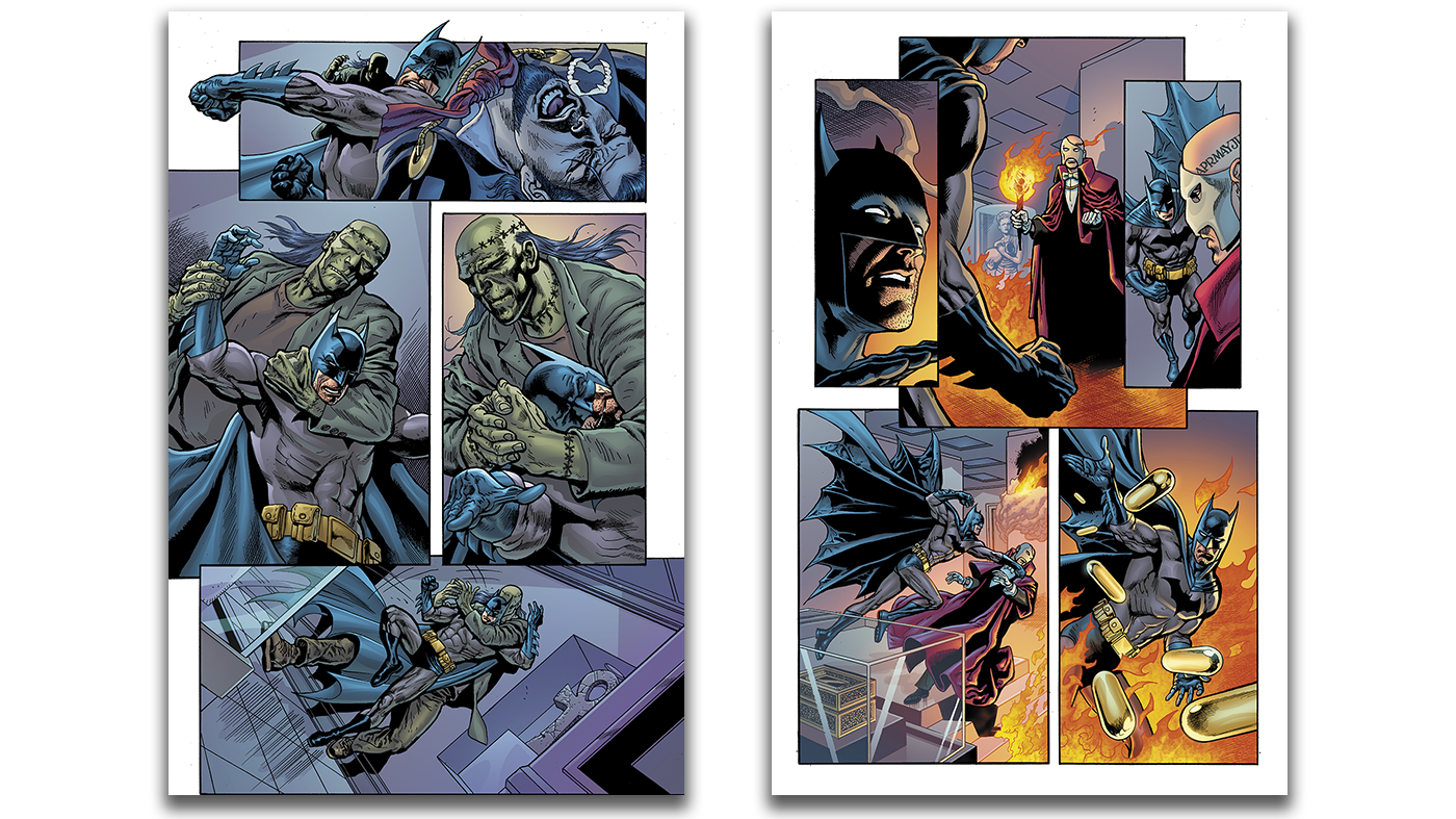
One of the most important aspects of telling a story with color is to read the script and plan ahead. In this story there are two pages where the museum is set on fire. I knew I would be using warm colors like yellows and oranges for the fire when we arrived at those pages. For contrast I was sure to use cooler blue and violet values leading up to the fiery scene for strong contrast and so the fire scene would have a bigger impact.
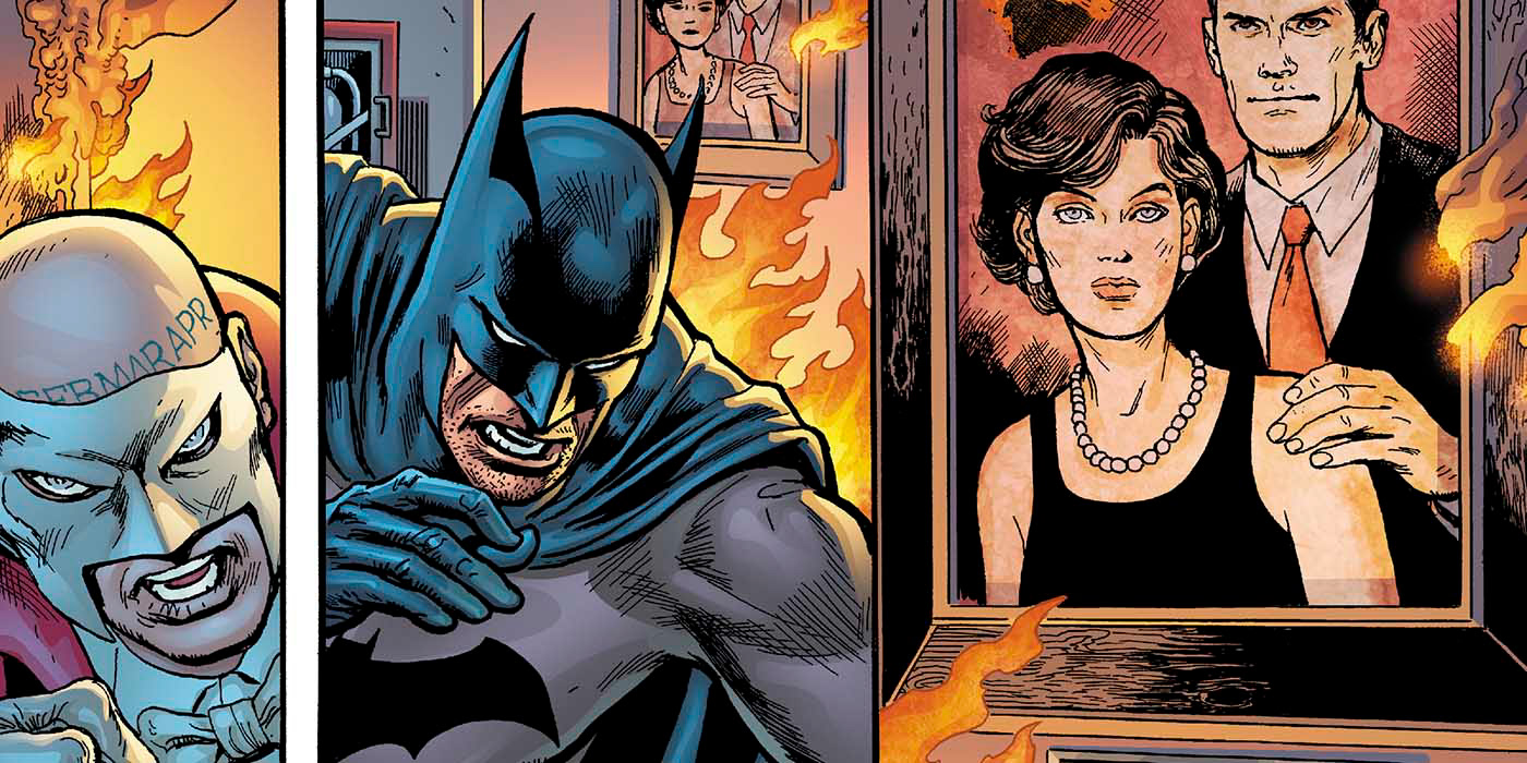
Another important aspect of visual storytelling with color is remembering not every surface shares the same properties. A flat painting hanging on a burning wall should not look as sculpted as the characters inhabiting the scene. Subtleties like this adds believability to the story and helps the reader stay engaged within the fictional world of the superhero.
I enjoy the opportunity to contribute the legacy of characters like Batman and it was a real trey to work on this special issue of Detective Comics with Dan Jurgens and Kevin Nowlan.
"You could not ask for a better, more professional or thoughtful colorist than Brian Miller. He’s not only always on time, he also makes the kind of storytelling choices that elevate any project he collaborates on. He can set the mood for a scene with his work and is always open to feedback and adjustments to make sure the best version of the project is the one that makes it out the door." — Michael Cotton, Executive Editor at AWA Studios (former editor DC Comics)
Artwork © DC Comics. All rights reserved. This artwork may not be reproduced, in whole or in part, without the prior written permission of DC Comics.